Do users really want more buttons in the Microsoft Office toolbar?
Adding more buttons on the Word toolbar is not only extra work for IT but a real training issue.
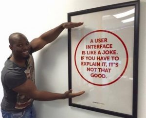 This picture is seen around social media regularly and here at Kutana we understand the joke intended. However, most people I know have never had a formal education in computing and do not know what a graphical user interface is, let alone it’s TLA (three letter acronym) GUI (pronounced goo-ey).
The finest example of a GUI and one most intuitive to use is Apple’s iPhone. The screen has easy to understand graphics, the person using the screen knows which buttons to press, and the button is the interface between the person and the smartphone.
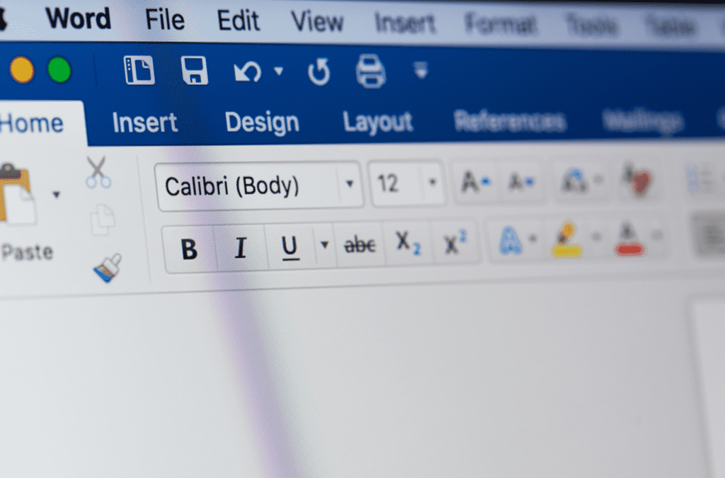
There are lots of examples of very smart and intuitive GUIs. In our professional office environment we are using the most famous GUI of all, Microsoft Windows. Those of us of a certain age (me included) will remember early versions of Windows and almost three decades later we are so used to using Windows that the interface itself has now become intuitive.
When we want a new document we look for the ‘File, New’ button. When we want to insert a table we look for the ‘Insert’ menu. And when we want to print, we look for the ‘File, Print’ button.
The Windows interface was so well known that Microsoft listened to its customers and changed the Office 2007 ‘Office’ button and reverted back to the ‘File’ menu in its later version. Nobody could easily find out how to print a document!
The Windows GUI works. It’s what we know and expect. It makes little sense, therefore, to reinvent the wheel with added buttons and macros to make printing easier. The problem with customisation is that with each change training has to be delivered to the user. A simple customised button placed on a toolbar to print a letterhead and a file copy still needs to be communicated to the user. Yet, we will intuitively look for the ‘File, Print’ or Ctrl+P button. So the more customisation and helpful buttons that are created actually increases the problems of training the users as well as maintaining the customisations.
Kutana has created Kappris to work intuitively with the Windows GUI. Users will always look for the ‘File, Print’ button and when they find it they see a very intuitive menu that helps manage the print options. And to keep consistency, the Print button is in the same place in Word, Excel and Outlook delivering a universal experience, no matter what the print destination is.
The most useful intuitive GUI of Kappris is in Outlook. Take a look at the video here and see how easy it is to reduce error printing and save time with lengthy email threads and multiple attachments.
With Kappris virtually no training is needed at all. As the quote says, “A graphical user interface is like a joke”. Worse than that, reinventing the wheel poorly it’s a waste of everyone’s time, energy and money.